Design Blog

Finished works, process sharing, works in progress, and inspirations

Event logo design for UPSTACK

UPSTACK’s annual retreat was held in Phoenix, AZ. My task was to create a logo and materials that evoked the feeling of the desert and surroundings. I chose to use Camel Back Mountain as the anchoring image. The retreat was held at the foot of this mountain.

I created a hand-drawn digital illustration with three times of day featuring the mountain: day, sunset, and evening. These corresponded to guests, sponsors, and staff. The collateral included name badges, environmental graphics, signage, menus, centerpieces, presentation decks, social media graphics and emails.

Theresa ChoiComment
Illustrative logo design with hand drawn calligraphy

Classic Cruisers is a specialty automotive shop that only deals with vintage Toyota Land Cruisers. The owners asked me to create and illustrative logo with the shop name in the same custom calligraphy used by the manufacturer. There were a lot of specific details on the car illustration that had to be correct because the target audience would immediately see any discrepancies.

Concepts

Theresa ChoiComment
Before and After: iOS Map App

The old version (left) shows a lot of clutter and some redundancy. I streamlined the screen to show just the selected point of interest with an easier-to-read layout and included a photo from the restaurant. This mockup is for marketing purposes.


Before

After

 
Theresa ChoiComment
iOS App Design

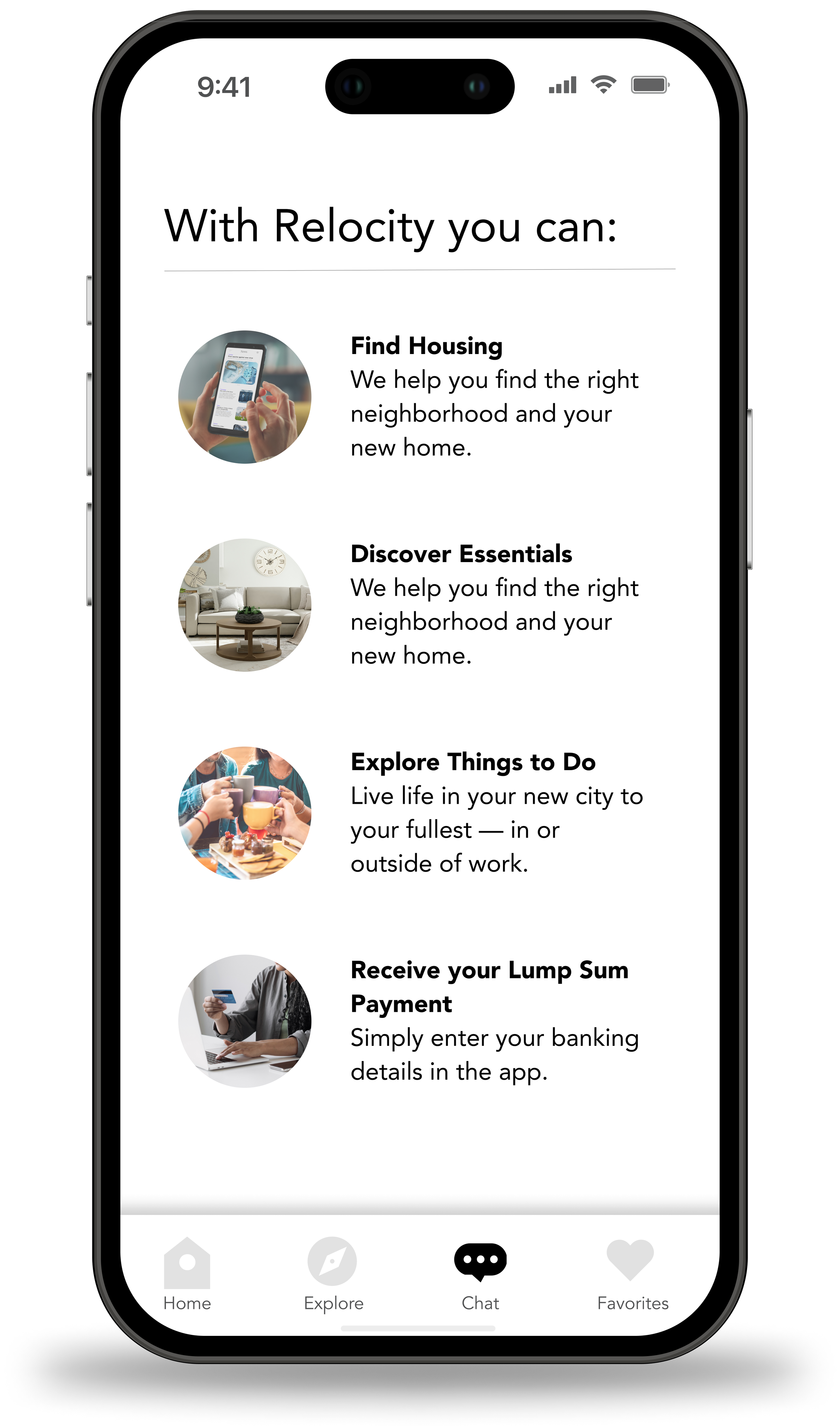
The previous version of this screen was text with some check boxes. These are two options that engage the user more through photos, icons, and an easy to understand layout.


Theresa ChoiComment
Before and After: Relocity

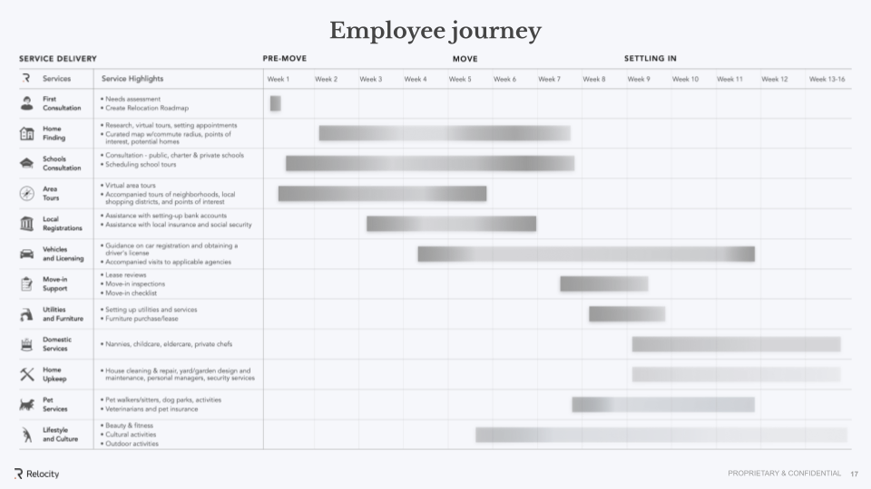
This slide shows the employee journey through the relocation process. It is quite dense and hard to read. I removed the icons and descriptions and added a subtle line to accentuate the different phases of moving at the top. The descriptions were moved off the slide and used as talking points instead. The result is much easier to understand at a glance.

Before

After

Theresa ChoiComment
BlueStar One Pager

Clients typically don’t understand how many words fit on a page. Content writers generally aren’t thinking about visual structure. The challenge here was to give the dump truck of a word doc I received a clear visual structure that was on-brand and fit on one sheet of paper. I did a fair amount of design thinking and organizing with good results.

Theresa ChoiComment
Investor Deck for Startup: Before and After

Like many startups, the client had thrown together a deck and wanted something more polished. It was important to capture the feeling of the company despite having no brand guidelines. I accomplished this task through some iterations and working closely with the client to understand the science presented on the slides. The end result made the client very happy.


Original Design

My Design

Theresa ChoiComment
MedTech Website Design

The assignment was to add in more pages to an existing design for this website refresh. I created the center graphic representing the company’s capabilities and did the layout for this page and others. This included hover states and overlays. The designs were taken into InVision for presentation to the client.

Theresa ChoiComment
Medical Infographic

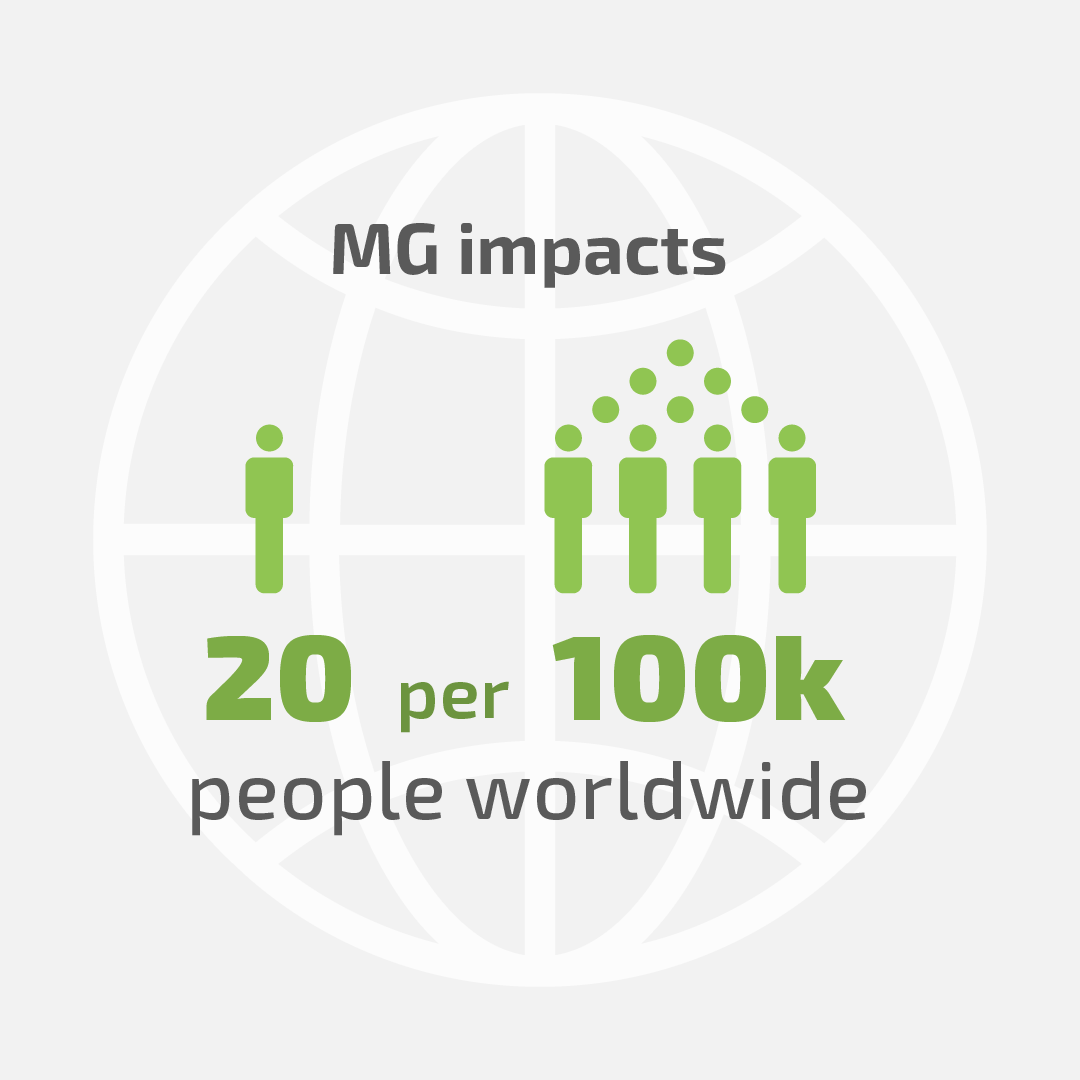
This infographic was to be shared across mobile and social platforms. The company had a lively brand identity, so that was fun to work with. The full size infographic is for mobile use only, and the stats had to be blurred for legal reasons.

final_argenx.png
Theresa ChoiComment
Branding for Real Estate

This trifold brochure set the stage for branding a boutique condo-focused real estate agency. It’s modern design and sensitive color palette appeals to the target audience of affluent 30-something tech workers.

condo_trifold.jpg
Theresa ChoiComment
Before & After: Layout

Tintri needed a "quick-start" type of document for its partners. The original felt cramped and hard to read. I redesigned the layout and organized the text so the reader can quickly scan the page and get the information. The icons were also updated to be of a consistent style.

Before: original document

Before: original document

After: my design

Theresa ChoiComment
Logo and Website Design

A local nonprofit gardening organization needed help with getting a more professional look. I designed a new logo that had dignity and warmth to reflect their culture of cultivation. The website mock-up is a simple improvement for what their web capabilities currently can handle.

Theresa Choi Comment
Minimal Night Scene

This illustration was inspired by a full moon I saw recently. First, I work in black and white to establish a value hierarchy. Then I play with colors and adjust.

Theresa ChoiComment
Wireframing with Adobe Xd

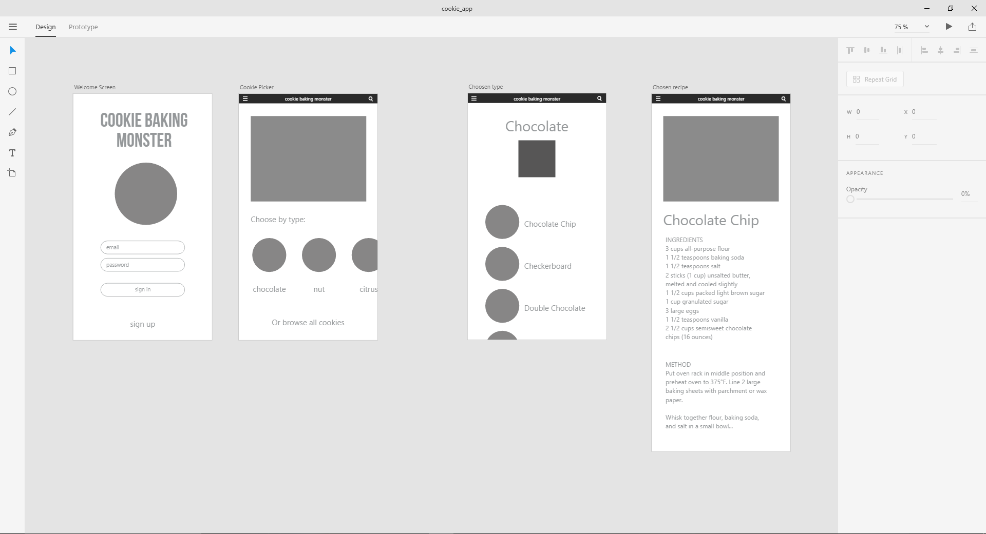
I am so exited that Adobe is developing Xd, it's own rapid design and prototyping software. I tried out the Windows Beta, and it's quite agile in handling. Below is a simple wireframe for an app that I've been "developing." This builds on the cookie icons I made a while back. Someone has to try the product right?

These would be the cookie icons that go into the circles.

And the fun part: making the connections between screens.

As of this moment, the Windows Beta version of Xd is lacking in some key functions that Mac users currently enjoy. I look forward to more updates on this software, it looks like this is the kind of program UI designers really need.

Before and After: Resume Re-Design

Stop employers in their tracks and get noticed.

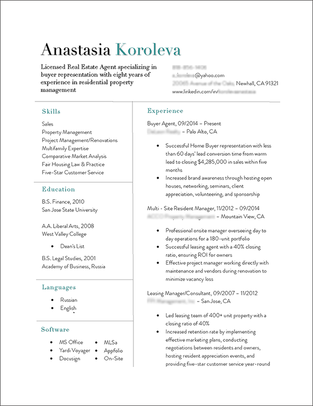
This project involved taking a standard text resume and elevating it to an eye-catching, professional level. I used my design skills and also my ability to improve the copy (text) to be the most effective and concise that it can be. 

BEFORE

BEFORE

This resume was too long at two pages. The amount of words needed to be cut down and re-written to showcase the best accomplishments and skills of this person. I crafted the narrative of the resume to tell the story of a rising star in her industry.

AFTER

AFTER

Naturally, such an accomplished candidate requires a clean, impactful design. I used my skills to design a resume that would stop employers in their tracks and take notice. The fonts are indicative of the candidate's personality and are appropriate for the industry niche that she is seeking placement in.

This candidate received several interviews within a few weeks, and each employer had remarked upon her great looking resume.

Do you need a resume update? Feel free to CONTACT ME to see how a redesign like this can help you.

Theresa ChoiComment
International Trade Show Booths

For three years, I had designed a real estate company's booth for the prestigious LPS Expo in China. This is a very large, international event for luxury properties. The design of the booth had the goal of capturing the high-end prospective buyer's attention and showcasing the client's inventory. In addition, the client wanted to sell the benefits of the location of the inventory. 

lps_guangzhou_booth_final_v2_Page_3_lr.jpg
lps_guangzhou2_lr.jpg

To help the client appreciate the design in context, I used SketchUp to mockup a 3D representation of the booth. This way the client can easily visualize walking through the booth. Since the event was in China, we could not preview the booth until after it was fabricated. So this 3D rendering was very valuable to have for preparing for the event.

Front-facing wall on lower level.

Front-facing wall on lower level.

Back wall on the upper level.

Back wall on the upper level.

Theresa ChoiComment
Logo Design WIP

Logo exploration for an Interior Designer. First, I sketched several concepts after the initial consultation. Then I did a second round on some of them in Illustrator. The third step was to consider typography and color.

Theresa ChoiComment
Landing Page Images

My client wanted to replace their landing page images. The previous images had been bland stock photos. The client wanted images that represented their unique take on the data storage industry. I used my photo compositing skills along with my eye for lighting and color. The results are more lively, meaningful, and colorful images.