Isometric diagram of a cloud-based software's architecture. Usually these diagrams are flat and very "MS Paint" looking, so the client wanted something more visually interesting but also technically accurate. I also designed the page layout for a nice presentation and incorporated a nod to the company's logo in the top right corner.
The client was a cloud-storage firm with a wonderfully quirky marketing theme: goats. So I designed this backdrop for their upcoming trade show. It captures the whimsy of their existing marketing with the goat flying a kite - a tetrahedral kite which bears resemblance to the company logo. The illustrative style is sure to stand out at a convention where most companies will do the typical "tech" look.
Below are a couple of alternative designs. The client preferred the illustrative route to the geometric.
Hand sketched from life with a pen.
Rue de Bearn, Paris
Place des Vosges, Paris
View from Maiori, Italy
In the 8th arr., Paris
Hayes Valley, San Francisco
Last summer I stayed at an AirBNB in the 11th district (arrondissement) of Paris. It was a cozy studio with a great view out to the Sacré Coeur in the distance. We got to know the neighborhood by walking. We would have a noisette and thé at a cafe in the morning, then proceed to explore and eat our way through the neighborhood. This map includes most of the places we visited near the 3rd district (troisieme). At the time we were there, a number of famous eateries and bakeries were closed for the summer vacation so if you're a learned Paris traveler, forgive me for going during August. Note for first-timers: don't go in August! Lots of shops are closed and most Parisians are out of town, leaving only the sweaty tourists.
WIP
A set of banner ads in various sizes for a rental agency.
For an artist, there's nothing worse than making your own business card and designing your own resume. The agony, the OCD, the procrastinating...but sooner or later, it must be done. Here's a WIP of my re-design.
I design in black and white first to focus on composition and contrast. Then color is added in. This one has a desaturated palette.
As a fan of Riesling, I'm often surprised how many people I meet have never tried it. So I made this infographic to give people what they need to know about Riesling. I started the design with blocking in the data and a rough layout. There were several changes as this piece developed, including moving the bottle to the right instead of my first inclination to have it be on the left. Hope this is useful to someone!
Basic layout.
Final infographic.
There are so many possibilities with an isometric cube pattern.
Study of a magnolia blossom. Acrylic on illustration board.
For Mike Perry Studios.
An experiment with that GEO.
Putting those cookies to good use.
Because I love cookies. Some of my favorites here.
A couple of mockups.
Working on an icon set for a website. Please see the ILLUSTRATION tab for more in this set, and the VIDEO tab to see animated versions of icons from this set.
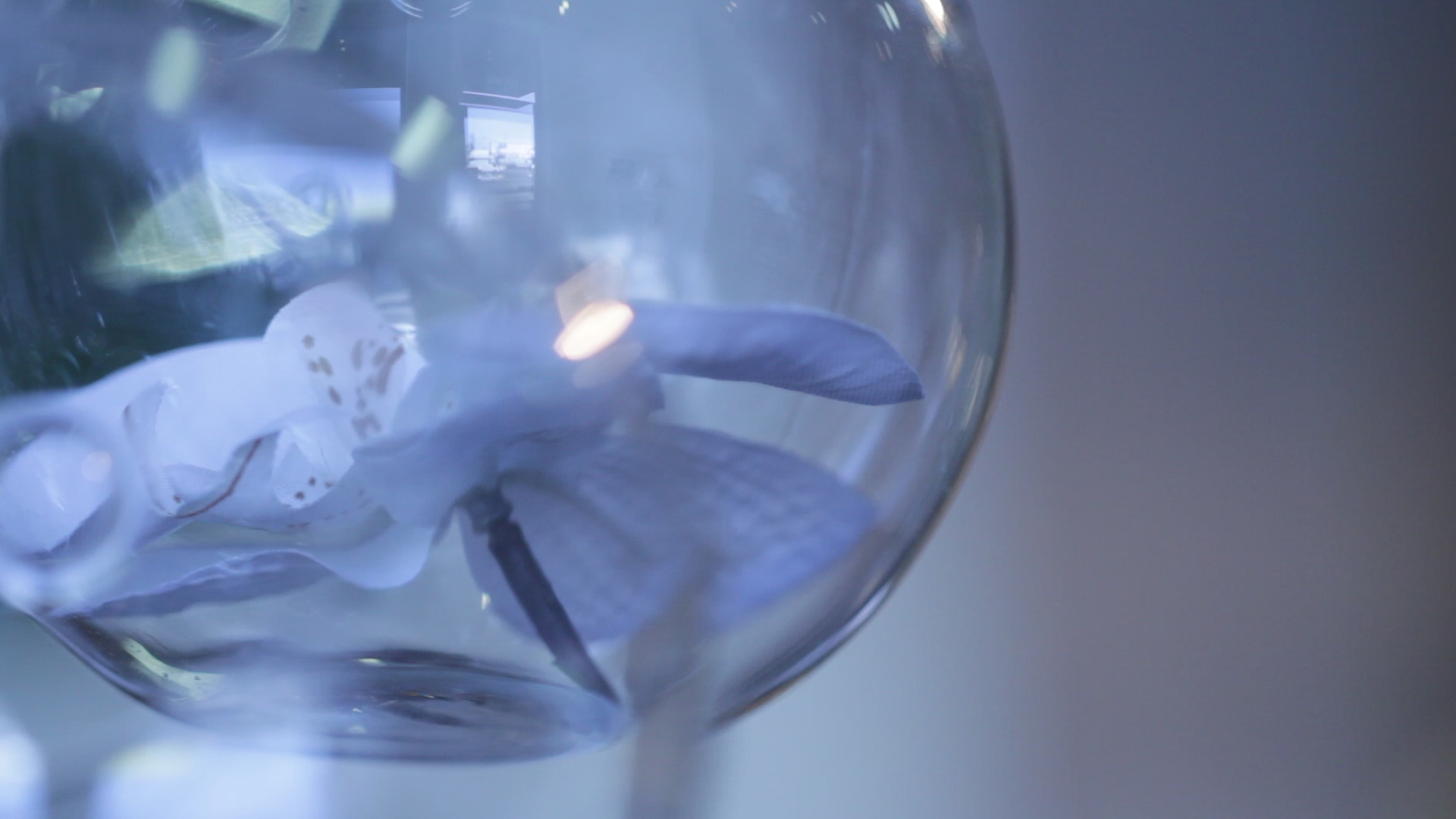
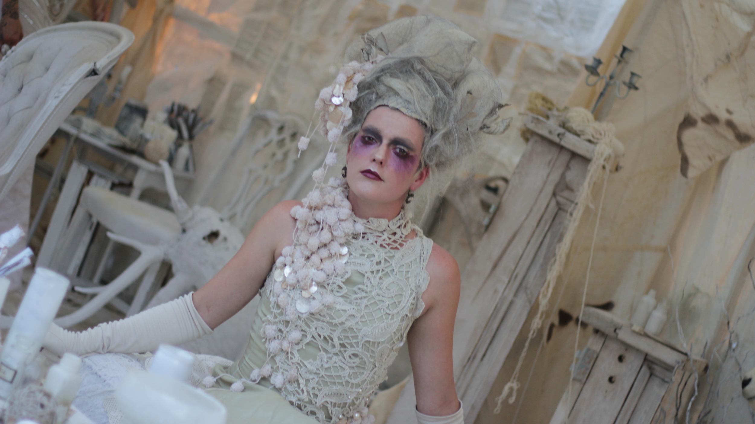
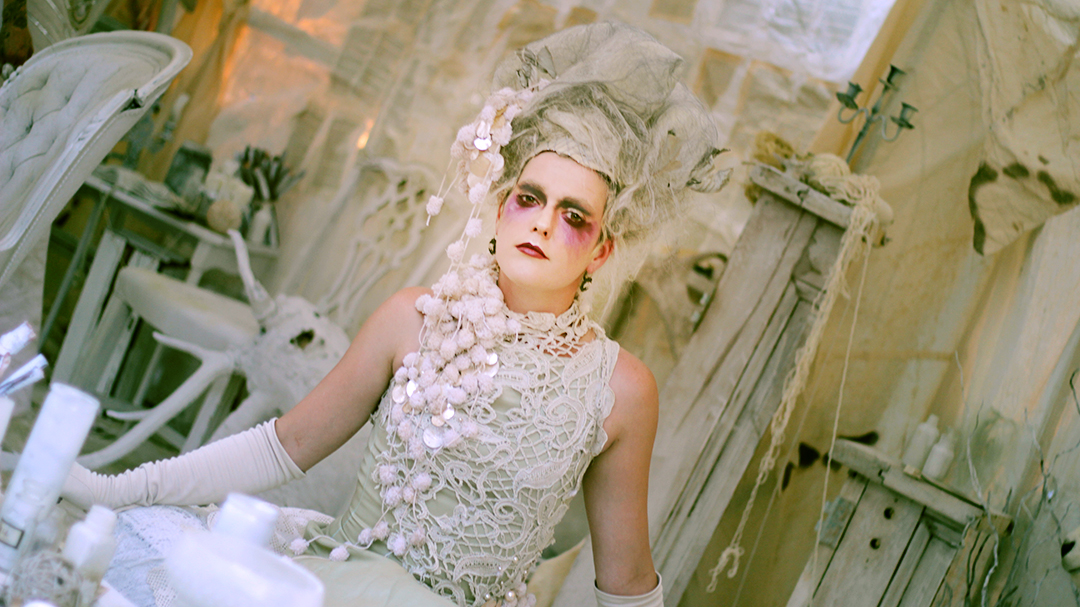
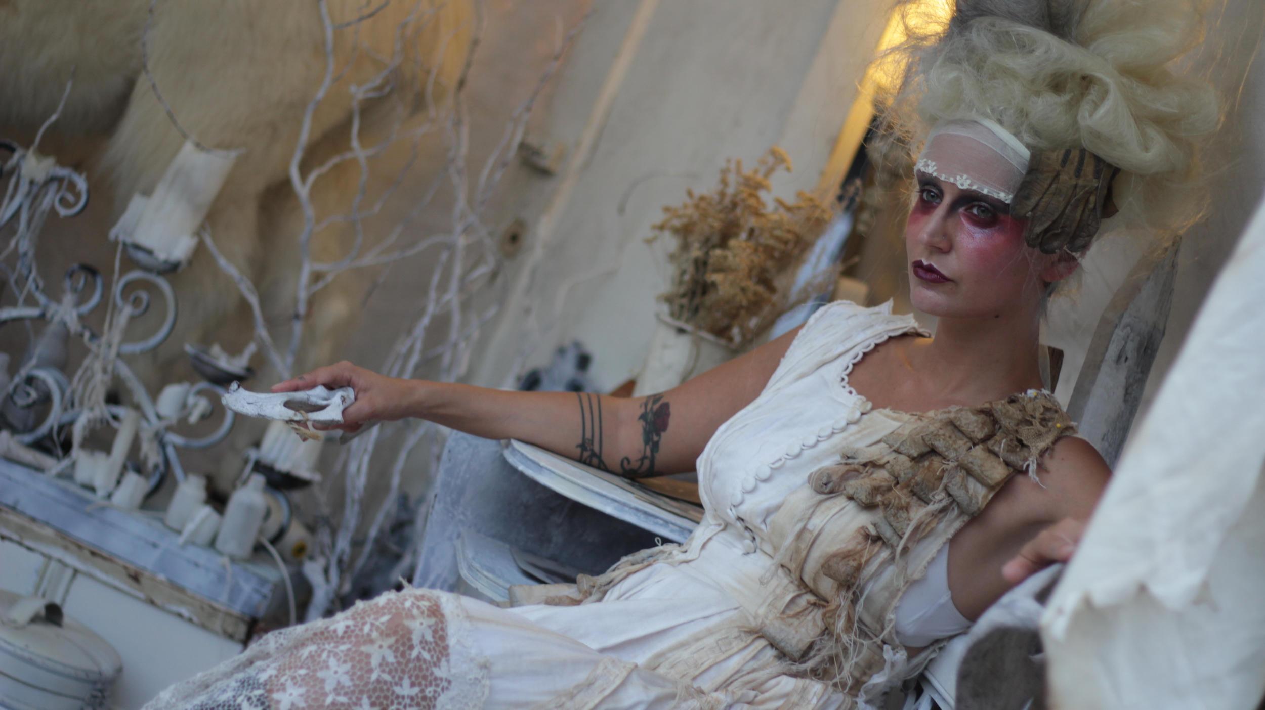
While the following images are video stills, the same retouching principles that work on photos work with videos. Video is somewhat more limited in what can be done as one is working with a series of moving images. My color treatment always has a purpose: to enhance the mood of the image, to better represent what the image felt like at the time it occurred so the viewer feels more than what the raw footage offers.
Before: a little dark and low contrast overall.
After: giving some warmth and light to the girl's face adds to the emotion of the scene. I also minimized the background contrast so that it would not compete with the main focus.
Before
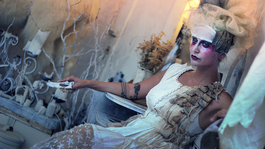
After: creating some light, when done skillfully, can completely change the feel of the image.
Before
After: an edgy look to match the client's hip branding (green is their main color).
Raw photo and then after color grading in Photoshop.
Before, raw materials, and after. Color makes a big impact for a summer sale, which was the goal of these ads.
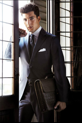


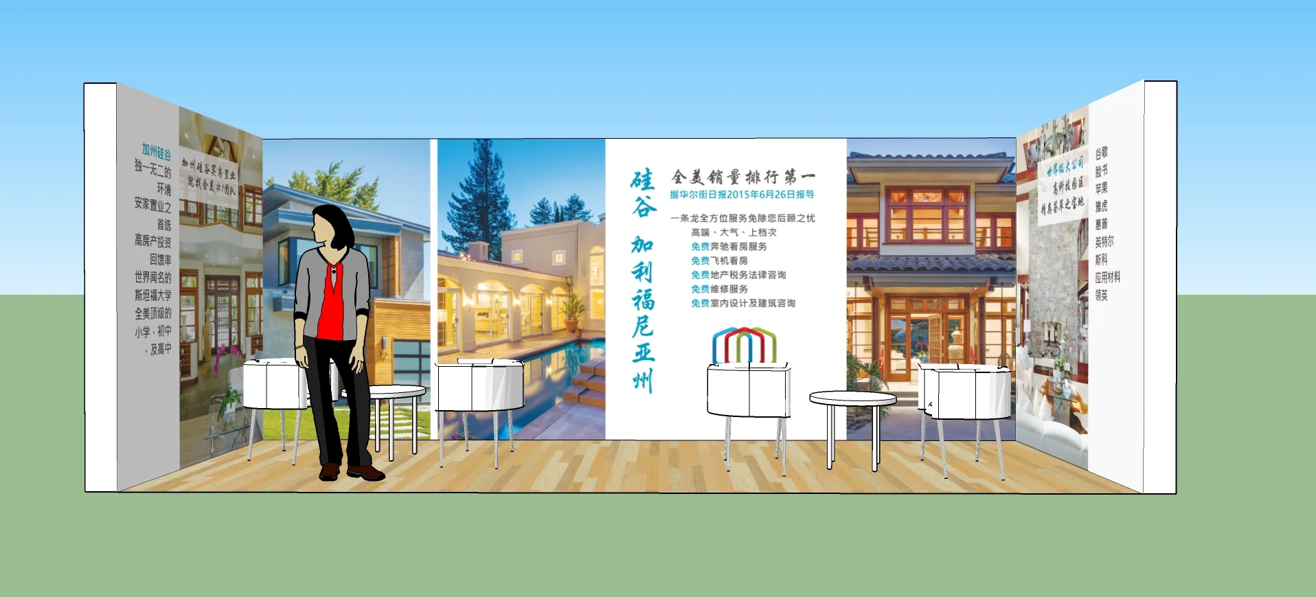
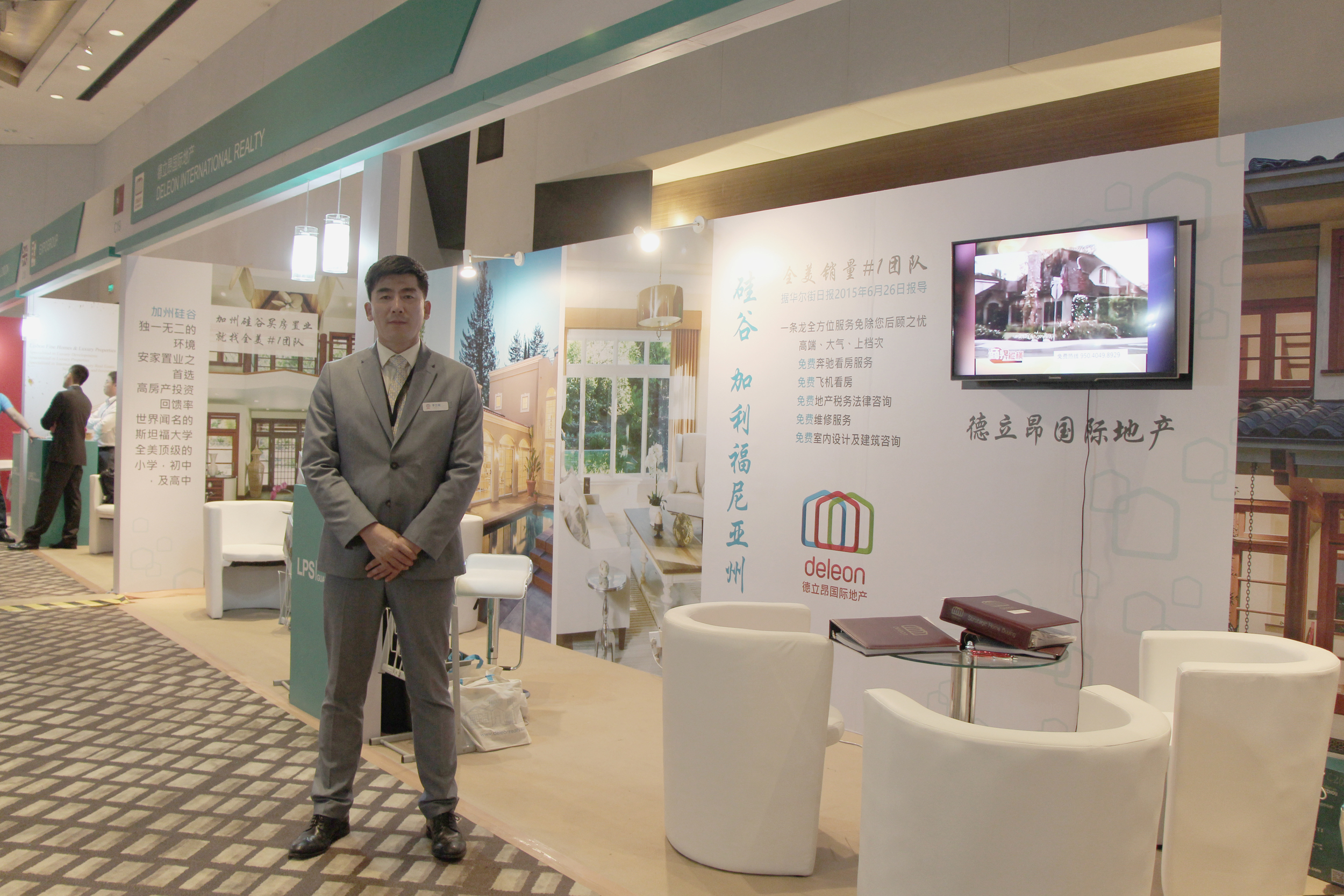
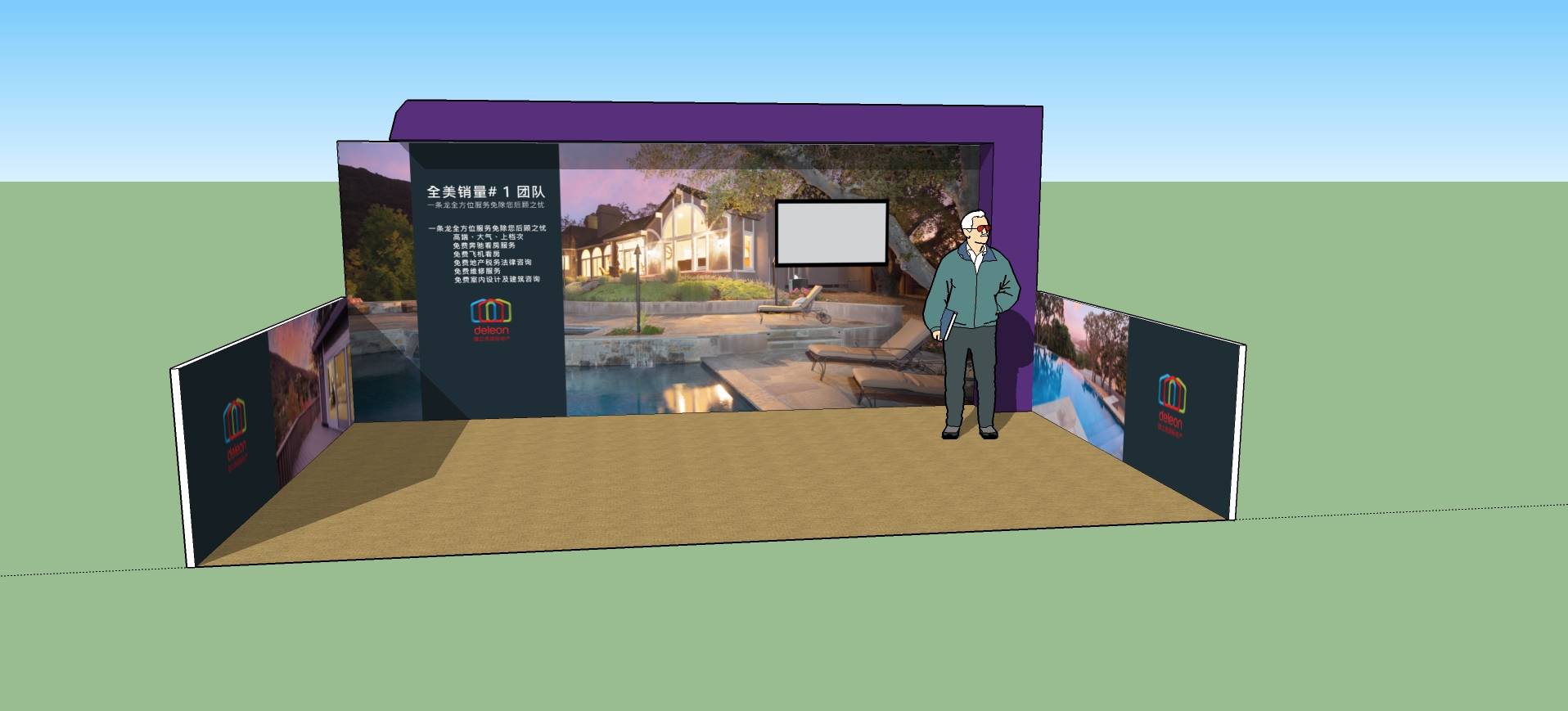
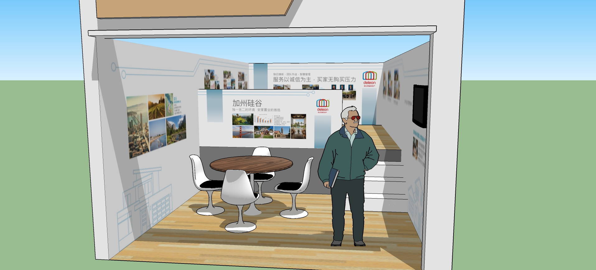
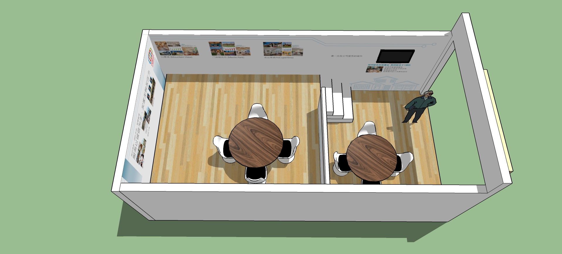
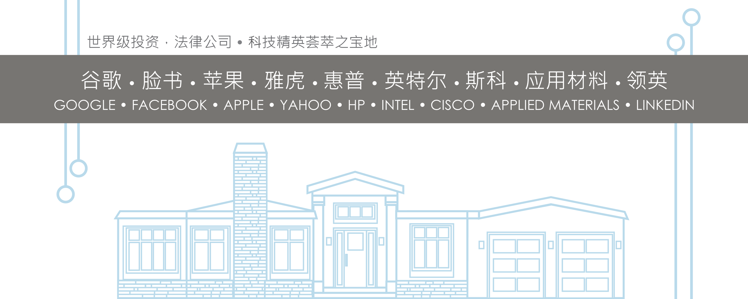
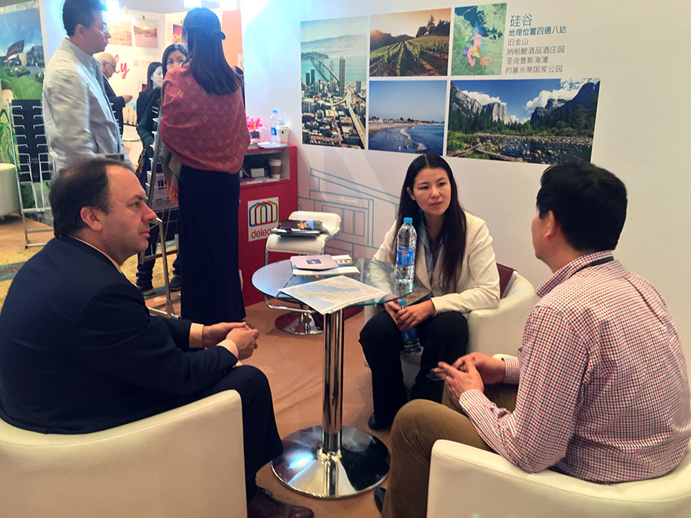
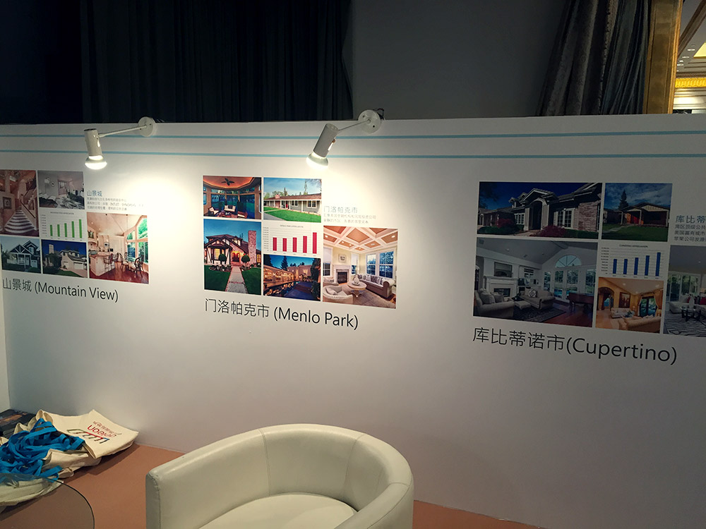
I designed trade show graphics for a few overseas real estate shows (Luxury Property Showcase). All shows were on mainland China in top cities, including Beijing and Shanghai.
Some logo explorations for an upcoming online magazine.


