Before and After: Relocity
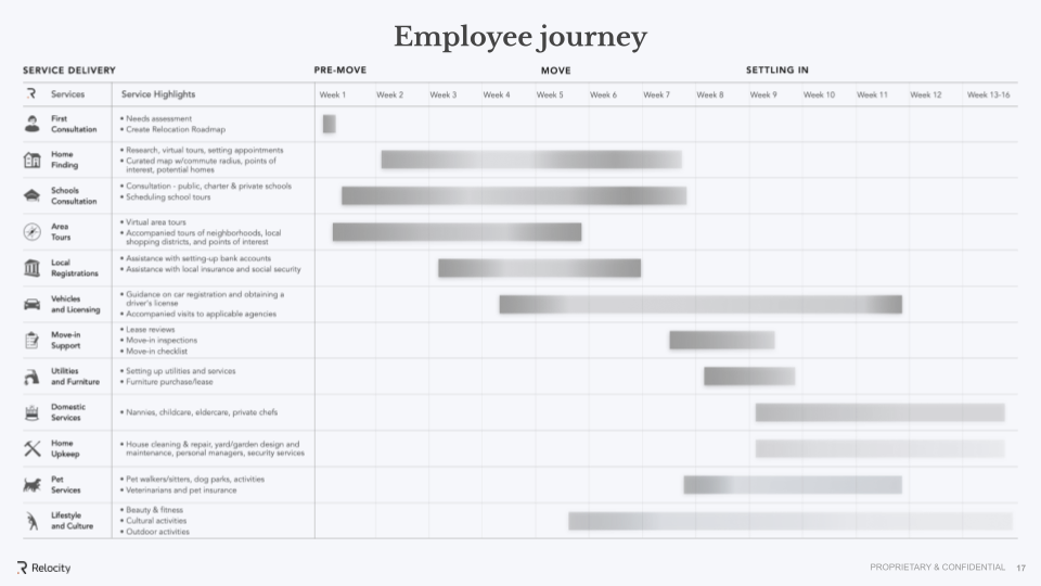
This slide shows the employee journey through the relocation process. It is quite dense and hard to read. I removed the icons and descriptions and added a subtle line to accentuate the different phases of moving at the top. The descriptions were moved off the slide and used as talking points instead. The result is much easier to understand at a glance.
Before
After

